Three Styling Tips To Make Your Photos Not Suck | Part II
In this video, we followed up our very first styling tip video to bring you three more tips to take your styling game to the next level.
Left: lighting cuts across the scene / Right: photographer shoots with the light source behind her
Consider textures: worn baking sheets add a rustic vibe.
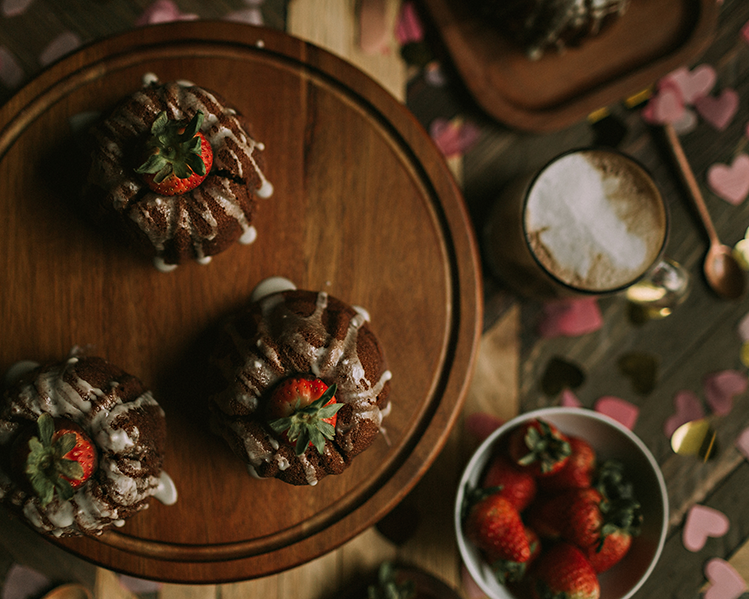
Pops of color draw the eye where you want the viewer to look. Use with care!
Layering can zhush up your scene. A towel can do the trick, but if you need more dimension, try layering plates, saucers, etc. as well.
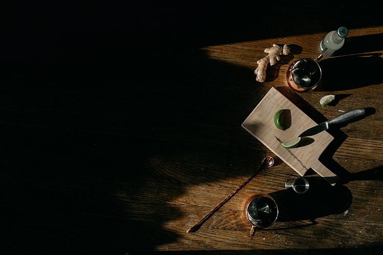
Negative space can evoke a solemn emotion.
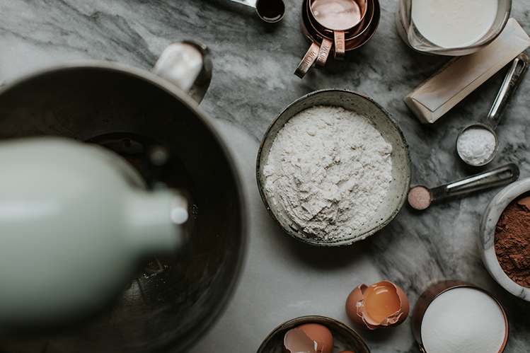
A busy scene can evoke the opposite feeling. Just make sure every prop adds to the story of your scene.
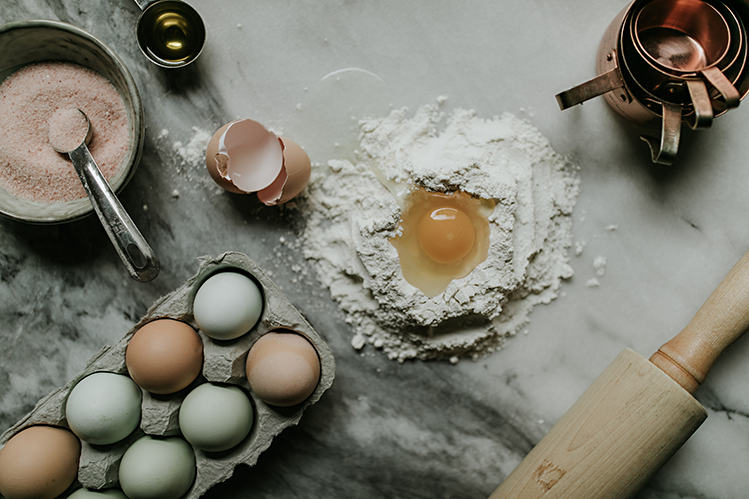
Consider your background. A simple cloth can provoke a rustic feeling, whereas a white countertop can provoke a fresh, clean feeling.


